curves p.2
source: http://www.thegoldenmean.com
Introduction to the Curves Command, Page 2
Applying the concepts to improving the tonal range of grayscale photos.
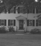
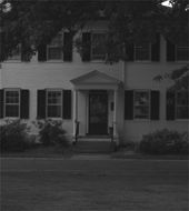
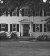
 Now it’s finally time to apply this tool to an image. For the first part of our discussion I am going to stick to a grayscale image. Color images introduce other issues and we’ll get to them soon enough; but for now we look at the following sad example. Shot with a digital camera on a hazy evening, it’s severly lacking in contrast — “snap”. It could happen to you! Can we improve it with curves? Let’s look at the previous curves and their effect. (A larger version is available here if you’d like to mess with it on your own.)
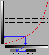
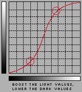
Neither the lighten or the darken curve is particularly effective at fixing all the problems, but you may have noticed that each of them had at least something going for it. Can we combine the best of both? You bet. A curve can have just about as many points on it as you could practically ever need. We’ll see what happens with two points — boosting the light values and lowering the dark values, all in one curve:
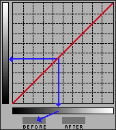
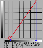 Actually, in an image such as this one with no black or white, the first thing I would do would be to force the range of tonal values to include the full scale. Did you know that the white and black end points in the grid can be moved too? If we keep the “curve” a straight line, but with a steeper slope, black and white come into the image and all the tones in between gain contrast. This trick alone is all lots of dull flat images need! The parallel to this technique is moving the black and white sliders in the Levels dialog to the beginnings and ends of the histogram (although as we will soon see, there are still some instances where there is an advantage to using Curves over Levels). (Micro Tip: to quickly invert an image, reverse the line: drag the black endpoint from the bottom left to the top left; drag the white endpoint from the top right to the bottom right.) Now you may be thinking not every image has a black or a white in it. True, but most do, and all your images will have more “pop” if the whole available dynamic range is utilized.
We’ve covered the conceptual basics. Before moving on to color images, here are three Power User techniques that will earn you the respect and admiration of your less informed colleagues. These three tips apply to color images as well (it’s just simpler to explain in grayscale), so don’t skip over this even if you never plan to work in grayscale.
 TIP ONE: Set Range With Eyedroppers
Let’s look at the right side of the dialog. “Preview” should always be checked so the image window reflects what you are doing. The “Auto” button should be used with caution; clicking the button will set the lightest value to white and the darkest value to black. This can of course be a time saver, but giving up control to an automated function is seldom the best course of action (it’s even more dangerous with color images, where it assumes the lightest and darkest points should be neutral!). Often the lightest meaningful tone and the darkest meaningful tone can only be detemined by you, and in the context of the specific image! However, the eyedroppers can be a help. (Since we have a grayscale image here, the middle, “neutral” dropper is meaningless.) Click on the black (left) eyedropper and then, in the image window, click on the tone you want to move to black. Do the same thing with white. Fast and precise. If you have been given target values (as you might if preparing files for print), a double click on one of the eyedroppers calls up the color picker, and you can define what exact value the eyedropper will set the image tone to!
 TIP TWO: Locate Values on the Curve
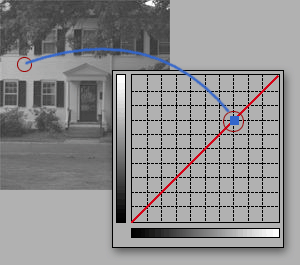
How’s this for cool: If you want to locate where on the curve a particular value in your image falls, move the curser into the image window. It turns into an eyedropper icon. Click and hold, and notice how a little marker shows up on the curve! Really helpful. Want to open up the subject’s face? Click and find out where on the curve that value lies. If that’s not good enough, it gets better! Hold down the command/control key while you click in the image, and Photoshop not only shows you where that tone lies, it automatically places a point on the curve for you! (Just make sure you don’t have one of the eyedropper tools active when you do this, or you’ll accidentally set a white or black or neutral point.)
 TIP THREE: Strengthen Local Contrast
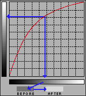
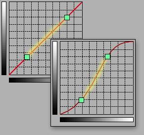
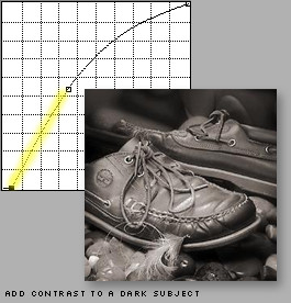
The final tip for this section is related to tip 2 above. We have talked about maximizing the available tonal range for your image. Now we get a little more deliberate. We’re going to talk about maximizing the tonal range for the subject of your image! Many photographs have a subject and a background or a foreground. Think about a portrait for instance. In most cases, we care more about the subject than we do about the background, so the effort should be to get as much snap and sparkle into the subject as possible. We’ve seen how the contrast is increased where the slope of the curve is steeper. Click and hold in the image window and move the curser around the subject, and make a mental note of the approximate parts of the curve the marker slides around. Now you know how you can find where on the curve the majority of your subject lies! Steepen the slope of that part and you will gain a great deal. You have to try it to believe what this tool can do for average photos. What you gain in the subject will be to some extent at the expense of what is not the subject, but in many cases that’s a fair trade–off — it’s background!
Here’s a before and after example of what I’m talking about, with the real life curve below:
With experience you will begin to see tones in relation to their position on the curve, and you will become much more sure and decisive. It’s a good idea to do a rough “mental analysis” before invoking the Curves command so you start off with a general idea of what needs to be done. Once placed, the points remain moveable. And you will find that as you place a point and begin to adjust the curve, the image preview becomes a powerful feedback tool — your hand will adjust the position of the point and the slope of the curve together as one gesture. You are not committed to the change until you click “OK”, and you are certainly not limited to one or two points (though I try to keep it to as few points as possible - often times 2 is enough; regardless of what you read in Photoshop books, don’t fall into the trap of making things more complex than they need to be). It’s not unusual for me to stay in the Curves dialog for several minutes, making subtle changes, tweeks and fine tunings before saying “OK”.
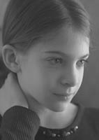
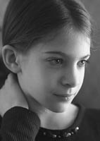
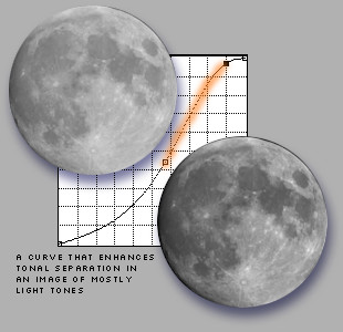
A little thought will help you realize that there is no such thing as a curve apart from an image, and no such thing as a generic curve. Every image is unique, and so is every curve. Visualize how the optimum curves might differ for photos where the important information lies in the light tones (a polar bear on a glacier), versus one where the important area is in the dark tones (a black cat in a basement), versus one where the subject matter is predominately middle values (as in the portrait of Becky, above). Now you know how to approach different images: run your mouse around the image window; note where the range of values lie and steepen that part of the curve! Here are two more examples:
It’s finally time to move on to Part 3» COLOR IMAGES, and Power User Tips!
« back to page 1