depth perception
source: http://www.thegoldenmean.com
Hand Made Highlight and Shadow Masks
originally written for the GurusNetwork.com
In real life, the clues we are given as to the shape, contours and surface quality of an object come primarily from shading. In the most simplistic case, an object in three dimensions is lighter on the side of the light source and darker on the side opposite the light source. A smooth solid has fewer, broader highlights and shadows than a bumpy object. A glossy solid has sharper transitions from highlight to base color to shadow, and the highlight washes out the base color faster. In order to imply depth, contour and surface quality, we must create believable tonal transitions that, by their shape, strength and placement imply the qualities of the synthetic object we have made. Highlights, shadows and gradients are the tools our eyes use to make evaluations about objects and surfaces.
Contemporary versions of Photoshop offer some sophisticated options for creating a sense of lighting and environment, including the powerful Filter>Render>Lighting Effects filter and the versatile Layer Effects. Layer Effects offer the artist the great advantage of extreme flexibility because of the variety of effects they offer, and because they remain “live”, permitting the artist to continually tweek and refine the effect over multiple editing sessions. The Lighting Effects filter is extremely powerful, permitting multiple “lights”, multiple colors, and the option of using a channel as a height map, giving unprecedented flexibility for describing a shape or texture. (Doc Ozone provides excellent coverage of the Lighting Effects filter; be sure to visit his Hands On Tutorials.)
Because they are new, many Photoshop users are familiar with these approaches. But some artists still prefer to describe light and shadow with more control than a filter provides, and are willing in some circumstances to accept the trade–offs in return for control. Before the advent of these new tools Photoshop users had other tricks. Some of these are less well known now but offer certain advantages (well, really only one, but it's a Big One: control!). This tutorial will demonstrate one of these hand–made lighting effects. Do I use this technique every time I want highlights and shadows? No way. But it is a very good way to learn about how depth and surface quality are implied in two dimensions, and there are still times when this methodical approach is the most appropriate for a given project. It's an important technique to master and keep in your bag of tricks.
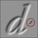
 We start with a shape which we wish to add depth to. For this demonstration I'm going to keep it simple and just use a nice, bold, round letter shape, but don't think this is limited to text. Any shape can work - logos, puddles (like Dark Garden’s puddle tutorial), graphical sketches ... just about anything (though originals with real thin lines won't like it too much). If you want to play along, I started with a 300x300 pixel canvas, and typed a big bold “d” in Garamond semi–bold italic. Choose whatever you want — just avoid real thin lines and try to get something a little rounded. I selected a medium value color: light enough to show the shaded edge, dark enough to hold the highlight. (BTW — the illustrations on this page are reduced to 150x150 so the page would render faster.)
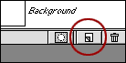
If you started with a type layer as I did, render it to a normal layer. If you started with a drawn shape (NOT a vector “shape” in the Photoshop 7 sense of that word) you’re all set to go on. I think it’s easier to have the shape on its own transparent layer, but it is not critical to the effect. The next several steps involve alpha channels. If you haven’t grasped their use, this is a good time to start. Begin by creating a new alpha channel of your shape. There are several ways to do this. The fastest way for me is to select the shape (if it’s on its own layer, command/control click the layer icon; if it’s on a flattened layer but a solid color then use the Magic Wand).
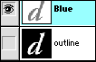 With the marching ants moving around your shape, choose Select>Save Selection and in the dialog box give it a descriptive name like “outline”; click “OK” and then deselect. We’re going to be making two more channels, so naming them really helps.
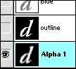 Switch to the Channels Palette. See that lovely channel? Duplicate it. I like to drag the channel down to the new channel icon. The duplicate channels gets named Alpha 1. Blur this duplicate: Filter>Blur>Gaussian Blur. This step is a critical one, and will have an important impact on the outcome. You'’ll need to do some testing. Generally the more blur the broader and softer the highlight and shadow; the less blur the tighter and sharper the depth. This is the control bit I mentioned.
 For this example I used a blur setting of 6. Note that the file resolution has a bearing on your settings too. If I were working for print at 200-300 DPI I'd need to use a higher setting.
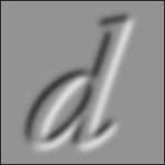
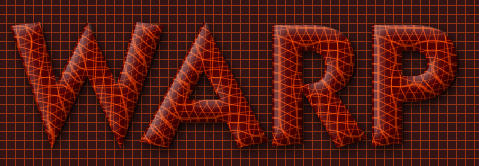
With Alpha 1 selected, emboss the channel: Filter>Stylize>Emboss with settings as illustrated.
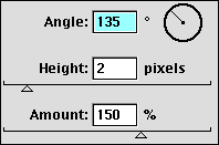
The combination of blur settings and Emboss settings have now defined the direction and height of the depth masks. The rest is just hand work converting these into usable masks.
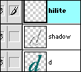
Duplicate Alpha 1 — the blurred and embossed channel. Now you have Alpha 2! Invert Alpha 2 (Command/Control plus “i”). To help keep things straight, rename Alpha 1 to Shadow, and rename Alpha 2 to Hilite.
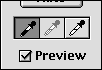 If there's anything tricky about this technique, here it comes. With the channel you labeled Shadow active, open the Levels dialog box. Select the black eyedropper in Levels and click anywhere on the medium gray area. Click Okay, select the Hilites channel and do the exact same thing.
Now trim the masks. Load the Outline channel into Hilites, Select>Inverse and fill with black. With the selection still intact, activate the channel you called Shadow and fill with black. Neatly trimmed. Deselect. It helps to give a small boost of contrast to both channels with another hit of levels or curves.


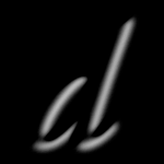
 All this work, and nothing to show for it yet. Here comes the excitement. There are two possible approaches at this point. To give more of a diffused, matte surface, you can load the channels one at a time into the main shape and use Curves or Levels to lighten and darken the shape, like this:
 With just a little more effort you can get a glossier feel. This involves making a new layer for the highlight and shadow tones, and setting the blending modes. Here goes. Make a new layer above the basic shape layer by option/alt clicking the new layer icon (simply clicking the icon creates a new layer, but option/alt clicking allows you to name the layer, and set its blending mode and opacity all at once!); in the ensuing dialog box, name the layer Shadow, set the blend mode to Multiply and say OK. Load the Shadow mask into this new layer and fill with black. Adjust the opacity to taste.

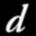
Likewise with the “lit” side: option/alt click the new layer icon, name it something you will remember, set blending mode to Screen, fill with white and adjust layer opacity. And from here you're on your own. The final illustration shows a drop shadow, an inner glow, an edge multiplier and an alternate background. But the fundamental cues we have supplied for a sense of dimension came from the basic highlight and shadow masks. The rest is all finesse; as long as you have those masks, you can do whatever you want to those areas. What if the highlight were both lighter and warmer? What if the shadow mask had some noise in it, and was cooler? With the masks already made you can do just about anything - lighten and darken are just a few of the possibilities.

Here’s the PSD file of this demonstration if you care to pick it apart.
So — I have liberated you from reliance on automatic tools. Please still use Lighting Effects and Layer Effects when it’s appropriate! But please fool around with hand made masks. It’s really pretty simple and fast to do once you grasp it, and there are times when it’s the perfect compliment to some other cool technique that just needs a little “pop” of depth! Here’s an example. I was fooling around with the displace filter and got a very cool displacement effect, but it didn’t come off the page. Highlight and Shadow masks, just as we have done here, brought it to life. Have fun exploring depth!
--top--