working smart
source: http://www.thegoldenmean.com
Building “Back Doors”
originally written for the GurusNetwork.com
Pro techniques for backing out gracefully!
(Author’s note: this article was written when Photoshop 5 was the latest version. NONE of the material is obsolete, but you may find some interface differences if you use a later version.)
Some critter from the wonderful world of nature (mole? prairie dog? ground hog? Doesn’t really matter), probably charmingly anthropomorphised by Mr. Disney, is famous for building their network of tunnels with a clever back door. Mister Trouble comes knocking at the front door, we’re outta here, out the back door.
![]() The fabulous programmers at Adobe have given Photoshop professionals lots of opportunities to build our image projects with the equivalent of a back door so we can tweek, finesse or even back out of a decision gracefully. The introduction of the layer concept with version three was the beginning, and each subsequent version has increased the sophistication of the layer concept. This article will give you a handful of production techniques I use to facilitate the revision process, because complex imaging, whether for a client or for yourself, is a process, involving evolution and refinement. Change is inevitable. Here are seven suggestions to avoid painting yourself into that inevitable corner! None of these are my original inventions, but every one of them has saved me at some point. These are not splashy special effects; they are everyday tools for those of us who spend every day working with images (especially scanned photos), and making those images look good. Consider these to be just plain fundamental good work habits. Do I follow these suggestions with every project? Nope. Have I regretted it when I haven’t? Uh, you bet.
The fabulous programmers at Adobe have given Photoshop professionals lots of opportunities to build our image projects with the equivalent of a back door so we can tweek, finesse or even back out of a decision gracefully. The introduction of the layer concept with version three was the beginning, and each subsequent version has increased the sophistication of the layer concept. This article will give you a handful of production techniques I use to facilitate the revision process, because complex imaging, whether for a client or for yourself, is a process, involving evolution and refinement. Change is inevitable. Here are seven suggestions to avoid painting yourself into that inevitable corner! None of these are my original inventions, but every one of them has saved me at some point. These are not splashy special effects; they are everyday tools for those of us who spend every day working with images (especially scanned photos), and making those images look good. Consider these to be just plain fundamental good work habits. Do I follow these suggestions with every project? Nope. Have I regretted it when I haven’t? Uh, you bet.
1) SAVE YOUR LAYERS Layers themselves are the biggest backdoor, and the simplest, most obvious. The subsequent suggestions take advantage of special kinds of layers, or special uses for layers. But before we discount plain old layers because they are so obvious, let me make one real obvious recommendation: Save your layered file! The native Photoshop format (.PSD) is the primary file format that supports layers (newer TIFF files can support layers, but I would still consider that risky for general print work). However, nearly every final image, whether for print, the Web, PowerPoint, needs to be in some flattened form: JPEG, TIFF, GIF, EPS ...... This means that at some point near the completion of an image you will need to collapse the layers into one flat file. Just before flattening, save; after flattening, save the flat file as a new name so it doesn’t overwrite the layered file. If you don’t save the layered version, someone is going to look at a proof and request that some doodad be moved just a little to the left. It’s a law of nature. It’s so simple if you have the layered version to go back to. Get into the habit now of saving the final layered version with your project files and avoid wailing and gnashing of teeth later.
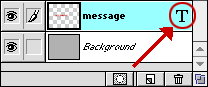 2) LET TYPE REMAIN DYNAMIC The type layer is a wonderful new special kind of layer with magical properties only equalled by layer effects and adjustment layers (more on that later). It is possible to render a type layer so that it becomes a regular layer, and sometimes this becomes necessary for special effects. But left alone, a type layer remains dynamic. That special “T” icon in the layer stack is the key to this magic. Double click the “T” icon (not the layer name) and the type dialog box opens with all the settings just as they were when you created the layer.
 (Note: this is one case where the interface in newer versions of Photoshop diverge significantly from what is shown here, but the point made remains the same. I trust you will consult your documentation to figure out how to use these tips with your own version of the application. Newer versions of Photoshop permit editing text directly on the canvas instead of in a modal dialog. And yes - Photoshop 7 DOES provide a spell check!)
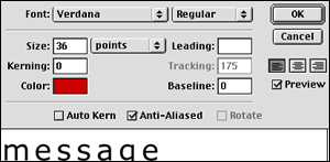
All the type options are now available for modification. (Don’t forget to highlight the text in the bottom pane of the dialog if it isn’t when the dialog opens.) You can tweek the kerning, massage the leading, change the color, switch fonts or antialiasing (all with the added benefit of a live preview in the document window). Right up to the very last minute. Even more remarkable, if you have implemented a Layer Effect (also coming later), the effect updates dynamically too! One of the features Photoshop does not yet boast is spell check; believe me, you’ll never need to curse again when someone notices a typo at the last minute. (Save your cursing for when they spot that typo after it’s published!)
3) BUILD EFFECTS INTO LAYERS whenever possible and practical. Purists will argue that a better drop shadow or bevel or glow can be made by hand with special effects techniques, and in many cases they are correct. But while the Layer Effects may not be as sophisticated as hand made effects, they redeem themselves by being, like Type, dynamic and infinitely editable. How do you get a layer effect?
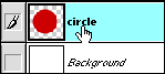
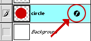 Control click (Mac) or right click (Windows) the layer name. Up pops the Layer Effects dialog, permitting any or all of the options to be applied, including the indispensible drop shadow, the useful bevel and emboss (inner, outer, pillow...), the outer glow and so on. These can be applied to any object on a transparent layer (meanng just about anything but the background layer). Now as if that wasn’t magic enough, you'll notice a new special symbol in the layer stack. As we saw with the type layer, a double click on this icon (not the layer name) opens the dialog with the exact settings we last had. Add to them or modify them as needed. Strengthen the shadow; scale back the bevel; change the color of the glow. Right up to the last minute. As often as needed. With no image degredation.
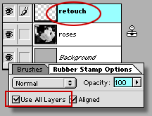 4) CLONE TO A NEW LAYER. Here’s one I’m trying to train myself to do more. Anyone who works with scans knows all about spotting with the Clone tool. This is an artform in itself: brush size, brush shape, brush hardness all have a bearing on how believable your retouching appears. This isn’t the place to talk about retouching technique, but this is the place to talk about how to get out of a booboo. You don’t always get the spot right on the first try. Sometimes you have chosen too big a brush, or too soft a brush, or you have it aligned wrong. If you see the error immediately, simply undo. If you don’t see it until several steps down the road, the history palette is your only hope, but that can be a pain if it means reverting several steps. The simple, foolproof method is to make a new layer dedicated to the retouching. Make sure the Clone tool is set to see all layers, and that the retouching layer is active. Then go for it. Any mistakes can be easily dealt with by intuitive tools like the eraser. It’s simple and effective.
![]() (Here's a tiny timesaver tiplett. You don’t need to name a new layer, but it sure helps when you have more than about 5. The standard advise is to double click the generic layer name (or control/right–click) and in the ensuing dialog give it a meaningful name. Faster is to hold down the option/alt key when clicking the new layer icon at the bottom of the layers palette. This immediately opens the layers dialog and now you can name the layer as well as set it’s blending mode right off the bat.)
(Here's a tiny timesaver tiplett. You don’t need to name a new layer, but it sure helps when you have more than about 5. The standard advise is to double click the generic layer name (or control/right–click) and in the ensuing dialog give it a meaningful name. Faster is to hold down the option/alt key when clicking the new layer icon at the bottom of the layers palette. This immediately opens the layers dialog and now you can name the layer as well as set it’s blending mode right off the bat.)
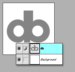
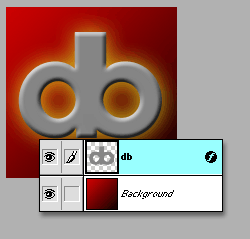
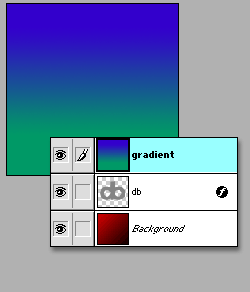
5) GET TO KNOW CLIPPING GROUPS. Clipping groups are sort of a wierd concept, but they are well worth learning about. Here’s the basic concept: the bottom–most object in a clipping group “clips” all the grouped items above it to the boundaries of its opacity. Huh? All right, simpler: Let’s say you have a logo, a simple shape. To jazz up this shape, you want to add some bevel, some noise, some texture and a color gradient. The obvious way would probably be to add each of these effects as a layer, but cropped to the logo shape so that they don’t “bleed” around the outsides of the logo. But what if you want to move how the noise falls? Or tweek the gradient? If you have cropped those layers to the logo shape you have no leeway. If, on the other hand, you have filled the whole layer with the effect but clipped it to the logo, you can move how they apply to the shape and still stay inside the boundaries. It’s “coloring inside the lines” with extra flexibility! In a sense you have a whole layer filled with something but all that shows is what falls inside the clipping group master shape.
![]() This still sounds confusing, so let me give you a practical example. When we get to the clipping group stage, you should know that this is accomplished by holding down the option/alt key while clicking the line between two layers. The cursor turns into this special icon, the solid divider line turns dotted, and the layers above the dotted line are clipped to the master layer. Sounds wierd, eh? Let’s see it in action.
This still sounds confusing, so let me give you a practical example. When we get to the clipping group stage, you should know that this is accomplished by holding down the option/alt key while clicking the line between two layers. The cursor turns into this special icon, the solid divider line turns dotted, and the layers above the dotted line are clipped to the master layer. Sounds wierd, eh? Let’s see it in action.
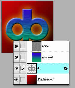
1) A simple graphic, isolated on a transparent background:
2) Gradient applied to background, layer effects applied to graphic:
3) New layer with color gradient:
4) New layer with noise, set to multiply; shows clipping group cursor about to be applied to line between layers:
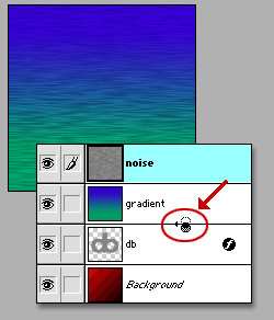
5) Gradient and noise layers clipped to logo master:
6) The layers remain moveable! Here's the gradient layer shifted; noise layer rotated:
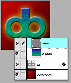
Here are a couple of observations from this simple exercise. One that just amazes me is that layer effects applied to the master shape affect the clipped layers above! Too cool. The other is that the clipped layers can be moved wherever you want, and all that shows is the part that intersects the master shape. It’s a blast to select the gradient layer and drag it around with the Move Tool. Although the logo shape is at the bottom of the stack it behaves as though it was a sort of cutout window through which you see the other layers. The layered file is here if you'd like to examine how it works.
6) MASK, DON'T DELETE This suggestion is here as a result of some lively debate on the forums as to the best way to blend two images. The term “best” is always hotly debated. The “best” way is the way that accomplishes what you need when you need it. But since the topic of this article is building in ways to back out of a decision gracefully, I offer this approach. Please consider it carefully, and make a point of adding it to your bag of tricks. The day will come when you find out why; I just hope you did it my way when that day comes.....
I am about to offer two examples of image blending using layer masks. But before getting into the thick of it, you need to be clear on what a layer mask is. I‚m going to have to assume you are acquainted with the concept of an alpha channel: a means of storing a selection for later use. Selections are temporary things; they can be saved in an alpha channel. This alpha channel can be loaded later, and it‚s as if the original selection never went away. Alpha channels can have black, white or gray. White corresponds to “what will be acted upon”, black represents “what will be protected”, and gray is essentially the same as feathering — that is, partial selection. These alpha channels (and there can be very very many on a complicated job) are stored by Photoshop in the Channels palette.
A common recommendation for blending one image into another goes like this: You have the two images on separate layers. You then create a new alpha channel, and in this channel you create a black–to–white gradient, with black on the side where you want the top image to show and white on the side where you want the bottom image to show. Now you activate the top image layer, load the new alpha channel and press “delete”. Works very nicely. The danger word here though is delete which means get rid of, throw out, disgard … in other words, no turning back. I for one am not that courageous. There is a better, more flexible and forgiving and reversible way.
![]() Try to imagine a way to accomplish what I described above up until the delete part. A layer mask is much like an alpha channel; it supports black, white and gray, and it can be acted on by any of the paint or editing tools. In fact, a layer mask is just like an alpha channel except that it is tied to a specific layer and affects only that layer. Just remember this simple formula when using a layer mask: Black hides the image, White reveals the image, and gray provides translusence depending on its darkness. How do we get a mask for a layer? At the bottom of the layer palette are several icons including the trash, the new layer and …the layer mask. (Note that this will not apply to a single layer file - it will only apply to a layer that supports transparency which the background layer does not.) Let's examine the usefulness of this advanced property of layers.
Try to imagine a way to accomplish what I described above up until the delete part. A layer mask is much like an alpha channel; it supports black, white and gray, and it can be acted on by any of the paint or editing tools. In fact, a layer mask is just like an alpha channel except that it is tied to a specific layer and affects only that layer. Just remember this simple formula when using a layer mask: Black hides the image, White reveals the image, and gray provides translusence depending on its darkness. How do we get a mask for a layer? At the bottom of the layer palette are several icons including the trash, the new layer and …the layer mask. (Note that this will not apply to a single layer file - it will only apply to a layer that supports transparency which the background layer does not.) Let's examine the usefulness of this advanced property of layers.
I have a boat photo and a sky photo and I want to combine them:
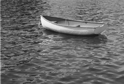
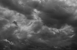
I could create a new document, but in this case I simply expanded the sky image’s canvas, and then dragged the boat image into the sky document, creating a new layer. Note the hard line where the two intersect. Our senses tell us this is wrong: we can't have a horizon this abrupt!
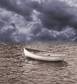
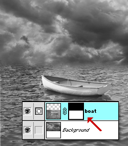 A layer mask is created for the boat layer. With the layer mask selected, a short, tight black to white gradient is created. Black at the top to hide the transition. White at the bottom to reveal the boat and water. Short and tight because I don't want to transition to go into the boat itself. Switch to RGB, colorize the two layers separately and a nice surreal sense is achieved. Since nothing has been discarded by the mask, I can go back and rework the transition to my heart’s content. If I want to see the clouds sort of wrap more around the boat, I can paint on the mask in black with airbrush tool to selectively and gradually reveal the clouds. Or not! Take a look at the layered PSD file here.
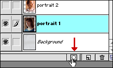 Onward. A portrait montage. The layered PSD file is available here. This project isn’t at all out of the realm of what might be asked of you, and this especially needs flexibility. I began with a background layer - a scan of some interesting textured paper. Two scans are brought in as separate layers, but they are not what we want with those hard edges. They need to blend into each other and the background. Sort of a painterly feeling (though photographers really hate that expression!). Select the first portrait layer (to make things easier, I hid the top layer while working on the middle layer) and click the Layer Mask icon.
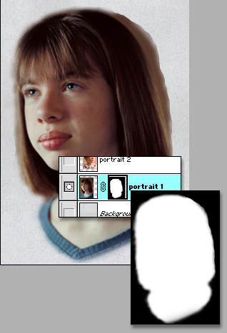 This mask wasn’t as simple as the boat sky gradient. It involved mostly painting with the airbrush tool. This gives a lovely soft edge around the hair and skin edges. I wanted a soft feeling, so I didn’t mind if edges blended a bit into the background. And I didn’t worry too much about that lumpiness at the back of her head, because the top layer is going to land there anyway. Remembering that black hides and white reveals, the process of creating the hand–drawn mask is one of switching back and forth between white and black (type “x” to toggle between foreground and background colors quickly) and switiching brush size. Large areas can be knocked out quickly using the lasso tool and filling with black, but the final boundaries are painted.
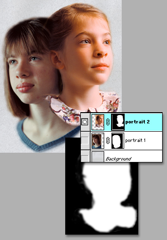 The second image is made visible, the second mask is created, and the image begins to shape up. Lots more retouching was done when I did this image for real, but for demonstrating layer masks - you get the point, right? And the point is this: if you approached a montage with selection tools, the eraser and the delete key you would have absolutely no opportunity to re–work it later, no easy way to finesse it as you were working on it, and no answer for the client who asks to have a bit more of the sweater or the dress included! With any image blending, but particularly with complex montage work, layer masks will preserve what shreds of sanity you have remaining. And Please: save your layered file (tip one). There’s no point to using these good work habits and then tossing them all with a flatten command. “Repurposing” is increasingly the way of the world today; who knows when you will need to rework the piece to fit a different aspect ratio or to accomodate a longer headline?
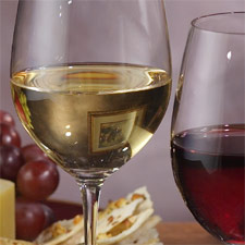
Here’s one more real life example. Our set for this catalog shot included a painting on the back wall as a prop, but the painting appeared refracted and distorted in the wine glass. The painting had to remain on the wall in the final shot, but its distracting reflection had to be removed from the wine glass. The solution was to take two shots, one with and one without the painting, so I could do some local retouching in the wine glass. I placed the layer containing the version without the painting on top of the layer containing the version with the painting. I created a Layer Mask on the “without painting” layer, and filled it with black which effectively hid that entire layer. I was then able to paint with white on the layer mask with the airbrush tool, “painting in” just the part of the glass without the distracting element! It’s just like magic.

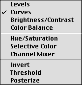 And that brings us to the last tip. 7) ADJUSTMENT LAYERS allow you to keep levels, curves, hue/saturation and other adjustments live and dynamic is just the same way Type layers and Layer Effects are. And layer masks work with adjustment layers too for local control. Adjustment layers are a special kind of layer, just like type layers are a special kind of layer. Adjustment layers essentially “contain” some of the most used image adjustment tools, as you can see from the popup selector list. What's the big deal? Every time you adjust an image’s tonality or color balance, it’s at the expense of some image data. (Proof of this can be seen in the levels command: open a new scan and its histogram in the Levels dialog should be very smooth; perform a Levels adjustment and click OK; open the Levels dialog again and notice the histogram is no longer smooth but “combed”; this is data loss.) Do it once or twice and the data loss is undetectable; do it repeatedly and it takes a toll in image quality.
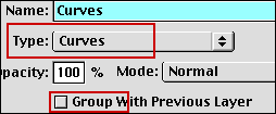 But it’s not always possible to hit the perfect color balance or contrast on the first try. Sometimes you need to feel you way through the fine tuning. Layer Effects permit all the experimenting you need or want with no data loss, because they don’t affect anything but the display until the image is flattened. To help understand the layer effect, try to imagine it this way: the layer that contains the effect “describes” the curve or levels or hue or whatever to every layer below it. To initiate a Layer Effect, command/control click the new layer icon at the bottom of the Layer Palette. (Newer versions pf Photoshop have a specific icon at the bottom of the Layers palette just for adjustment layers.) Select the type of adjustment you wish to make, and the standard dialog box for that adjustment immediately appears: Curves, Levels, Hue/Saturation, whatever. Make your adjustments just as you would normally. Click OK and everything behaves as it would normally.
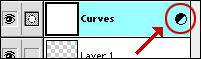 UNTIL — you want to modify the effect! Note the special icon next to the Adjustment Layer name in the layer stack. Double click the icon and, just as with a Type layer or a Layer Effect, the dialog box for that particular adjustment opens with the last settings; you can modify them, add to them or start all over again, and no pixels have actually be modified, no image data has been lost. The description of what effect the Adjustment would have has been updated. Note the dialog in the previous paragraph: Adjustment Layers can be grouped (Tip 5). Adjustment layers can also have a Layer Mask (Tip 6); in fact, if you have an active selection when an Adjustment Layer is created it automatically creates a Mask, so the adjustment is constrained to that area. Simple. Powerful. Versatile.
 Here is a final examples from a recent catalog I shot digitally. I had a digital photo that was fine overall, but the champagne in the two glasses was sort of dead. I loosely selected those two areas with the lasso tool and created a Curves Adjustment Layer. The dialog opened with an automatic Layer Mask, and I could brighten up those areas independant of the overall image.
![]() There you have it - my top 7 most useful techniques for working with images at the highest level of professionalism, while maintaining the option of re–working those images with the minimum of effort, tears and quality loss. They take no more time than less strategic methods, and they will make you more efficient and productive. We know that ultimately almost every image will need to be reduced to one layer for its intended final purpose; but as that image is developed these 7 uses of traditional and special layers will make the process far more flexible for you. Your colleagues will think it’s magic. You will smile and tell them “Nope — it’s brains!” Now go and put them to use in whatever area of endeavor you find yourself laboring in!
There you have it - my top 7 most useful techniques for working with images at the highest level of professionalism, while maintaining the option of re–working those images with the minimum of effort, tears and quality loss. They take no more time than less strategic methods, and they will make you more efficient and productive. We know that ultimately almost every image will need to be reduced to one layer for its intended final purpose; but as that image is developed these 7 uses of traditional and special layers will make the process far more flexible for you. Your colleagues will think it’s magic. You will smile and tell them “Nope — it’s brains!” Now go and put them to use in whatever area of endeavor you find yourself laboring in!
--top--